Bay Area Housing Market Analysis Part 2
In this second part of the series we take a look at some public Redfin data. Specifically taking a deeper dive into purchasing a property in the East Bay.

Welcome to the second part of the housing market analysis series! In the previous section, I covered some basic time series analysis on the Zillow Rental Market dataset for the Bay Area. The analysis is performed in Python using Jupyter, Pandas, and Plotly. If you have not seen the first part yet, please do so.
Overview
In this second part of the series we take a look at some public Redfin data. Specifically taking a deeper dive into purchasing a property in these cities:
- Oakland, CA
- Berkeley, CA
- Alameda, CA
- San Ramon, CA
- Dublin, CA
- Fremont, CA
The deeper dive will include a breakdown of different housing types for each area. The housing types are: Condos / Co-ops, Townhouse, Single Family House, Multi Family House, and All Homes. Use the following links to help you navigate to the sections you want to look at.
Intro to dataset
Inventory Comparison
Median Price Per Square Foot
Seasonal Decomposition
Revisiting Price to Rent Ratio
Conclusion
References
For those of you just interested in the Jupyter Notebook I created for this analysis, you can find that in the References. Also, as a side note I am going to include the plots as images in this post. If you want the interactive Plotly charts please go to the Jupyter Notebook. The images are much more mobile friendly.
The Dataset
Redfin provides public data on housing sales, inventory, list prices, etc. There are about 45 indicators in total. Their data site actually provides a very good interface for visualization through Tableau. You could actually get a lot of this information from their site directly and playing with the data yourself. Therefore, I will not be covering data you can visualize directly through Redfin's Tableau portal. Instead, I will take a deeper dive into applying statistics to this dataset.
Here are all the different indicators they provide:
Index(['Worksheet Filter', 'Measure Display', 'Number of Records',
       'Avg Sale To List', 'Avg Sale To List Mom', 'Avg Sale To List Yoy',
       'Homes Sold', 'Homes Sold Mom', 'Homes Sold Yoy', 'Inventory',
       'Inventory Mom', 'Inventory Yoy', 'Median Dom', 'Median Dom Mom',
       'Median Dom Yoy', 'Median List Ppsf', 'Median List Ppsf Mom',
       'Median List Ppsf Yoy', 'Median List Price', 'Median List Price Mom',
       'Median List Price Yoy', 'Median Ppsf', 'Median Ppsf Mom',
       'Median Ppsf Yoy', 'Median Sale Price', 'Median Sale Price Mom',
       'Median Sale Price Yoy', 'months_of_supply', 'months_of_supply_mom',
       'months_of_supply_yoy', 'New Listings', 'New Listings Mom',
       'New Listings Yoy', 'Period Begin', 'Period Duration', 'Price Drops',
       'Price Drops Mom', 'Price Drops Yoy', 'Property Type', 'Region',
       'Region Type', 'Sold Above List', 'Sold Above List Mom',
       'Sold Above List Yoy', 'State', 'State Code', 'Table Id'],
      dtype='object')
How is the data correlated?
Correlation models help us gauge related data sets. They will tell us if two sets of data are positively or negatively correlated. Positively correlated means as one set increases, the other also increases. Negatively correlated means as one set increases, the other decreases. The two most common methods of determining correlation are the Pearson and Spearman methods. I have referenced the Wikipedia articles for you for more information. Additionally, if you are looking for a good Python guide on this check here.
The correlation tables are specific to All Homes across Oakland. I chose this because the values for the other cities will be more or less the same. They are a bit of an eye chart, but I have color labeled them to make them easier to visualize. Darker blue indicates negative correlation, darker red indicates positive correlation. The chart is also scaled down to the following indicators: Average Sale to List Price, Homes Sold, Inventory, Median Days on Market, Median List Price Per Sq Ft, Median List Price, Median Price Per Sq Ft, Median Sale Price, Months of Supply, New Listings, Price Drops, Percent Sold Above List.
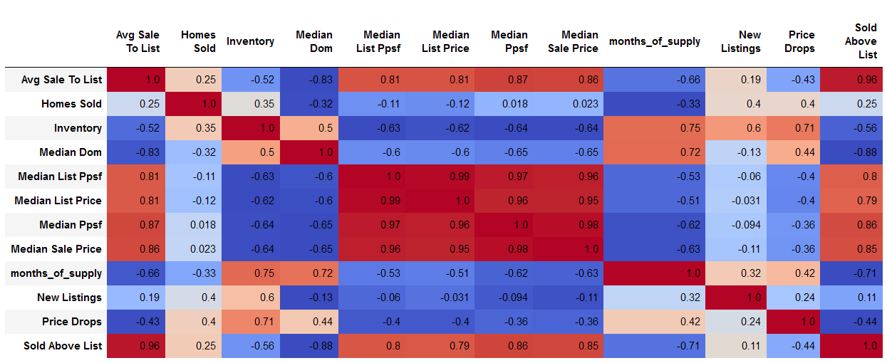
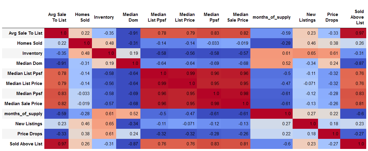
There are no major discrepancies between the Pearson and Spearman tables here so my analysis will be referencing both sets of data. You may look at the data in more depth on your own if you would like to draw your own conclusions.
As expected, the huge chunk of red in the center means that all the Median List and Median Sale prices are extremely strongly correlated. The Days on Market (Median Dom) is negatively correlated with the List and Sale Prices. It is also negatively correlated with the Sale to List price. This makes sense because as a house stays on the market longer, the price should go down to sell it. The Median List and Median Sale prices are negatively correlated with the Inventory, thus confirming that as more houses come onto the market, the price should decrease due to saturation. No big surprises here, but I do think it's pretty cool to see the data in this format.
Comparing Market by Location
Here, instead of simply looking at the quantity of inventory, we are showing the relative percentage of inventory per location. With this information we can see what percentage of houses for sale in a given location are Condos, Townhouses, Single Family, or Multi Family.

For all locations, the primary listing was for a Single Family home. Dublin and Fremont also have a 20-30% mix of Condos. Berkeley and Oakland have very few Townhomes, but instead have about 20% Multi Family units for sale.
I have some time series plots on this data available in the Jupyter Notebook if you're interested in comparing.
Number of Homes Sold
Next let's look at how many homes were sold by type in 2017.

Oakland has by far the most homes sold at about 3800. Fremont is second at 2000, nearly half of Oakland. San Ramon is third at 1300. Berkeley and Dublin are both between 750-850. Alameda trails the pack at 600. The Homes Sold distribution does mostly matches the inventory distribution we saw. The only difference is that the Multi Family unit sales do not quite match the inventory percentages.
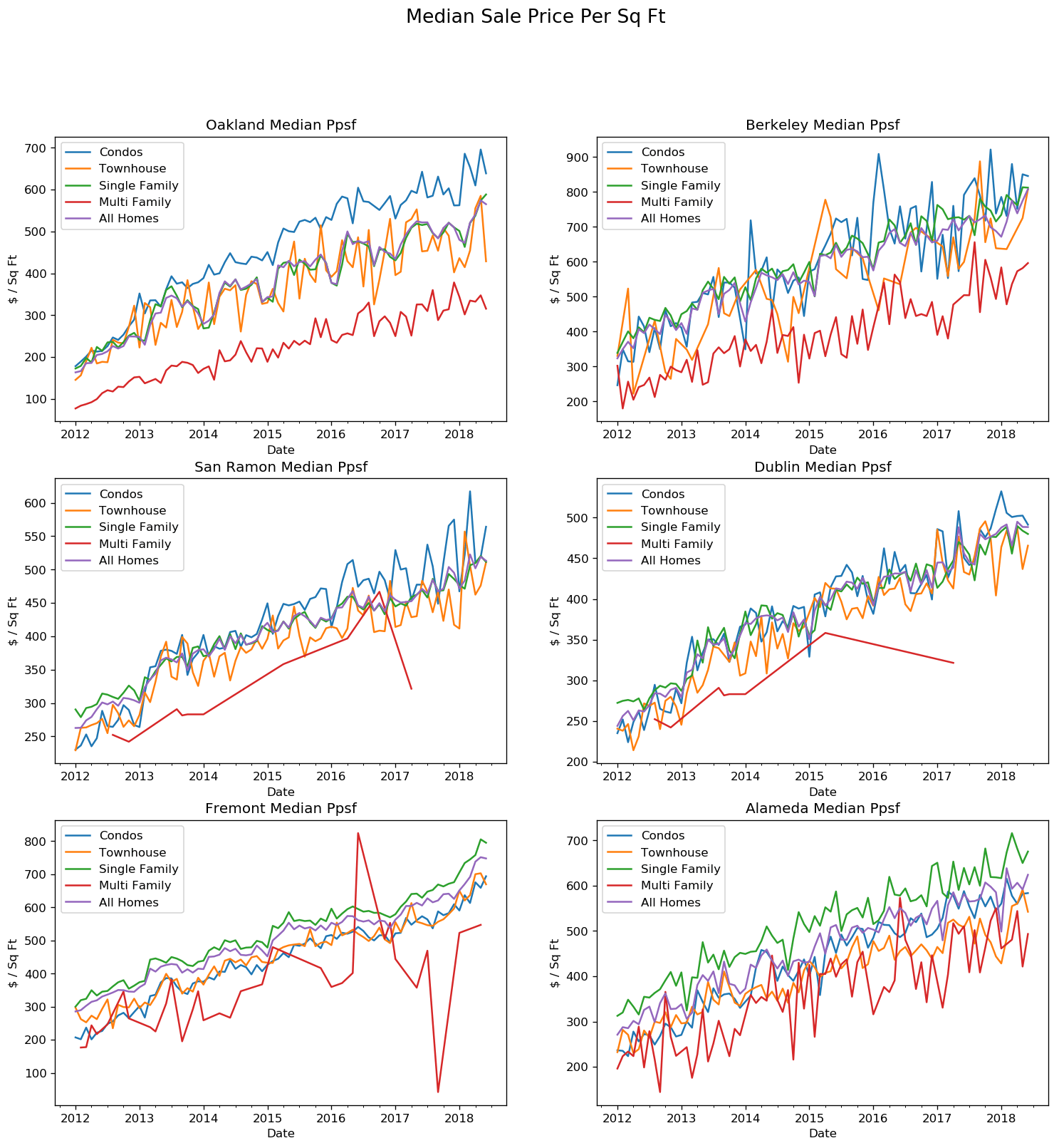
Median Price Per Square Foot
Here we see that in Oakland, Berkeley, Dublin, and San Ramon, Condos command the highest price per square foot. Berkeley is by far the most expensive price per square foot, currently standing at $800 per square foot. With Oakland Condos currently at $650 per square foot and San Ramon at $550 per square foot, they actually seem frugal in comparison.
Fremont and Alameda both show Single Family homes as being the highest, currently at $750 and $650 per square foot respectively. Townhomes look like the best value and compromise, though Multi Family units will give you the best bang for you buck. The Multi Family house dataset is pretty limited and thus erratic for Fremont, Dublin, and San Ramon. From the previous section we learned that those cities have very few, if any, Multi Family homes sale each year. Conversely, in Oakland and Berkeley the Multi Family home market seems to be thriving and could offer a great value. My partner stated none of this was new information to her. I really enjoy the visualization of it nonetheless.
Seasonal Analysis
For the first post I did some time series plotting, and eyed the seasonal trends within the data. In this section we will analyze the data using an actual seasonal decomposition model using the statsmodels package. Essentially, the decomposition will show us three key figures: seasonality, trend, and the residual noise. The seasonality will show how much the value increases or decreases as a function of the time of year. The trend will show how the overall series value increases or decreases over time. The residual is basically the remaining data from the series that cannot be fit into the other two categories. It is also referred to as the error.
If you want more information on the specifics of how seasonal decomposition works, please refer to this guide.
From the previous section we did notice some seasonality to pretty much all cities we looked at. Let's do a deeper dive into Oakland's seasonal decomposition as an indication of the rest of the group. In this plot we can see the observed data in blue, seasonality in orange, trend line in green, and residual in red.

There is a strong seasonality to this series as we can see. Just eyeing the seasonality trace we see that it hits a low point in January, and a high point around June. I would expect the other cities to follow suit. The trend line shows that the price per square foot is increasing linearly over time, as expected. The residual noise falls between + and - $40 / sq ft.
Next we look at the seasonality across all cities. Note: this is just the seasonal component from the previous chart, but it allows us to see the variation in seasonality for each city. I plotted red markers and month indicators to clearly outline the high and low points. Because the plot is cyclical, the high points and low points will occur in the same period every year.

The graph can be a little tough to read so here are the high and low peaks broken down for you:
Oakland: High - June, Low - January
Berkeley: High - April, Low - January
San Ramon: High - June, Low - December
Dublin: High - August, Low - February
Fremont: High - May, Low - December
Alameda: High - June, Low - March
So depending upon the city, it looks like the best times to buy are between December and March. The worst times to buy are between April and August. The difference between the high point and the low points can be as much as 18%. Buying at the low point can save you as much as 10% on the price. As always, this is not gospel nor by any means 100% accurate.
Revisiting the Price to Rent Ratio
To validate the Zillow Price to Rent Ratio (PRR) indicator plot from Part 1, I decided to calculate my own PRR. However, I am still using the Zillow's rental data for this since Redfin only has sale price data. Basically the PRR is the sale price divided by the one year rental price. Since there is limited rental data available, we will only be looking at the January 2017 - April 2018 time period.
Note that Investopedia and other online sources indicate that the prime buying market is when the PRR falls between 1-15. If the PRR falls between 16-20, it is most likely better to rent than to buy. If the PRR is greater than 21, it is much better to rent than to buy. This should not be the only indicator used when purchasing a home, and it is just that, an indicator.


The first thing to notice here is how variable the Calculated PRR is in relation to Zillow's PRR. However, they are pretty close to each other all things considered. Berkeley and Dublin currently have the highest PRR at ~29. Both sets agree that San Ramon is currently at ~24. The Calculated PRR shows Dublin at ~22 whereas Zillow shows Dublin at ~24. That is a 9% difference. Lastly, the Calculated PRR shows Oakland at ~22 vs Zillow at ~21. Only a 5% difference.
There are two factors that I can think of that would explain the difference in data. First, the rental market can be highly volatile. This is why Zillow publishes the Zillow Rental Index that takes the variation and limited datasets into account. Second, there is likely a seasonality component. My guess is that Zillow is taking both of these into account when it comes up with its Price to Rent Ratio.
Conclusion
If you have made it this far, congrats! Thank you for reading. I hope you found this beneficial, and insightful. We looked at quite a bit of data. I would encourage you to take a look at the Jupyter Notebook and Github repository I have linked in the References if you want to see any additional details, or if you're interested in seeing the calculations yourselves.
TL;DR
First, we saw all of the different indicators that Redfin provided us with and calculated the correlation coefficients across those indicators. The Days on Market (Median Dom) is negatively correlated with the Sale to List price. The Median List and Median Sale prices are negatively correlated with the Inventory, thus confirming that as more houses come onto the market, the price should decrease due to saturation.
Single Family homes dominate the market in all cities. Dublin and Fremont also have a 20-30% mix of Condos. Berkeley and Oakland have very few Townhomes, but instead have about 20% Multi Family units for sale. The total homes sold per year per type of home matches the percentage of inventory per type. Oakland leads home sales by a large margin, followed by Fremont, San Ramon, Berkeley, Dublin, and Alameda.
Condos are the highest price per square foot in Berkeley, Oakland, San Ramon, and Dublin. Single Family Homes are the highest price per square foot in Alameda, and Fremont. Multi Family homes give you the best value, but are only really available in Berkeley and Oakland.
Seasonal decomposition told us that there is a significant seasonal swing to the housing market that can vary by city. The best times to buy seem to be between December and March. This could save you about 18% on the total cost.
Finally, we did some checking on the Zillow Price to Rent Ratio and found that it was fairly accurate. I believe Zillow adjusts for variance in the rental market and in seasonality in its computation of its Price to Rent Ratio. According to Investopedia because all of cities' PRRs are above 21 at this point, it's probably still better to rent than buy.
References
GitHub Repo for this series
Jupyter Notebook for this post
Redfin Data Source